

Collateral, for those who aren’t aware, is the media used to support the sale of a product or service. Think of brochures you may pick up at a convention or the materials left at your business following a visit from a sales person.
In this article for LinkedIn Gal Borenstein, CEO of the digital marketing firm The Borenstein Group in Washington D.C., says companies of all sizes must-have collateral.
“When the client gets a call from a prospective buyer, partner or investor requesting more information, what do they have to send? That embarrassing tri-fold brochure they just ran off the printer? Maybe some direct mail postcards from the trade-show in ’08? Or better yet, some of their partners’ materials they’ve been using. Even if they don’t expect to have a massive request for sales materials, they will have requests. If they don’t have some semblance of professional materials that speak to what they bring to the market, they simply won’t be taken seriously – nor should they be.”
If you want to be taken seriously you NEED collateral. I spoke with and Melissa Pierick and Troy Theis ––TDS’ respective copywriting and graphic design gurus––to find out what makes good collateral.
Clear as a bell
Without hesitation Melissa and Troy say clarity is what’s most important. If the message isn’t clear and easy to understand you run the risk of being ignored or losing the customer.
To help you create collateral that’s clear as a bell Melissa and Troy offer up these seven do’s and don’ts.
- Don’t use jargon
Every industry has its own words, expressions, or terminology that may be difficult for others to understand. Melissa believes it’s essential to avoid jargon at all costs! “It’s important to think about the copy from an outsider’s perspective,” she says. “Try to picture someone in your target demographic. Ask yourself would they be able to understand this?”Most importantly don’t over complicate sentences. “Write how you speak, not how you think you should speak,” she says.
- Don’t worry about length
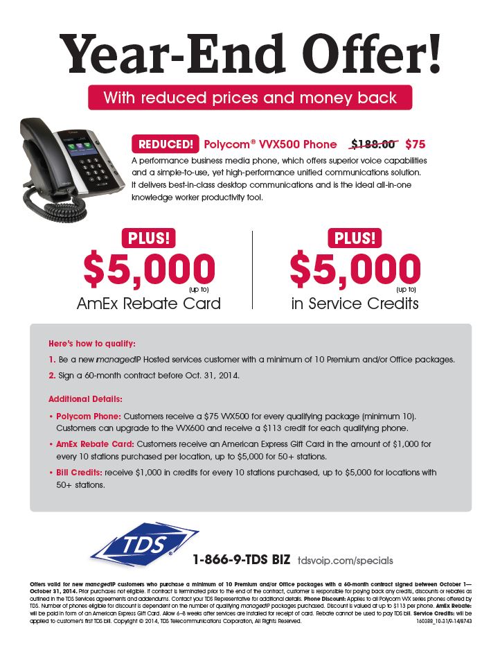
In the interest of being clear you may think less copy is better. Melissa says that’s not always the case. Every word you use should have a purpose and be given careful consideration. However, “If you need to explain 10 different things then explain 10 different things. Don’t sacrifice critical elements for length,” she says.Here’s an example of a piece of collateral outlining TDS’ current year-end managedIP Hosted promotion. The piece is full of necessary information about the offer. It thoroughly explains the offer without overwhelming the reader.
- Keep your sentences short
As long as they are meaningful, write as many sentences as you want. But, keep your sentences short. Remember, your main goal is clarity and shorter sentences are easier to understand.Taking a look at our example again you’ll see each sentence averages about 16 words. That’s pretty much in line with what blogger and marketing guru John Gregory Olson recommends in this post.
- Use headlines
Readers should be able to get the gist of your collateral by scanning its headlines. And yes, it’s ok to use more than one headline. If you take a look at the example we used earlier you’ll see multiple headlines like, “Year-End Offer!” and “Reduced! Polycom® VVX500 Phone$188.00$75.” - Be consistent and recognizable
Collateral that’s designed well should have a consistent look and feel. You can do this by using the same elements (color, fonts, and logo) on your pieces. Troy says, “People should be able to look at TDS pieces and say, ‘Oh this is from TDS about their managedIP Hosted product.’” If you have multiple pieces, they should look like they are members of a family—they are different, yet alike. ” One way to ensure you’re achieving this familial look is to spread your collateral out on a table. Does it all go together? Could elements be more consistent (e.g. does the logo appear in the same spot on each collateral piece?)If you’re creating promotional materials, consider establishing a separate identity for promotions. And then carry that identity through the life of the promotion. We did this with the Year-End Offer materials. They look different than our standard managedIP Hosted materials.
- Use whitespace
White space is your friend! Troy says, “People want to stick everything and the kitchen sink on their collateral. But they shouldn’t.” If your collateral has too much going on it creates confusion. Utilizing white space helps keep things clear. Try reducing copy or removing non-critical messaging elements. - Hire professionals
As a small business owner you probably don’t have deep pockets. And you may be tempted to put your own collateral together. But hiring a professional copywriter or designer is a better investment. “Not to be harsh but just because you did really well in 12th grade English doesn’t make you a Copywriter,” says Troy. “Just because you really enjoyed art as a child doesn’t mean you’re a Graphic Designer.” Many copywriters and designers work on a freelance basis (that is, you can pay them by the piece). So, you’ll not only get a professionally written and designed piece, but insights and expertise to take your collateral to the next level—and set your business apart from the competition.
Tell us what you think by leaving a comment below or reaching out to us on Facebook and Twitter.
No comments yet.